

Little custom Cursor
15th of July 2025
made a cute little Coke Zero themed Cursor after seeing Rusty Bites's have a really cute little diet coke one on her page
so to Aseprite i went to make this happen.
I cheated a little as i wanted to get the classic shape just right and i just wasnt managing to figure it out free hand so i imported a photo i took of a can to use as a base for the image
that helped pull it together imediately , i then played around with the colours and how to place the "text" (more like randomly placed dark pixels to create the illusion of text )
I feel like there are ways i could improve this

But Im pretty happy with how it turned out.
I want to spend more time in programs like Aseprite to actually get good at pixel art because the things i have created are pretty basic and i still need alot of help
Ive always been better at physical art pen on paper than i have at digital art but it is a skill i want to get better at
although i could always draw an image on paper and import that into aseprite to create a weird combo of digital and physical media

added a mini little post about one of my latest obessions too, a cute indie magazine i came across online and I love it,
it took me a while to finalise the post because people kept coming and distracting me while i was trying to write it
cue my ADHD frustration to go into overload
Im not sure if i fully was able to capture my joy with how i was writting but i hope it comes across

Beta Homepage goes live
12th of July 2025
I had been testing out recoding the home page in a beta file so i could really tidy up the spaghetti code i had created while learning to build this page
the rest of the pages remain overboiled spaghetti but it is slowly starting to look a little more polished
it feels really cool to have made somthing even if it is just really basic compared to some of the beautiful sites i have seen on here
but i have to remember that i came into this with no knowlage of code at all and that when i started i couldnt even get my boxes to line up
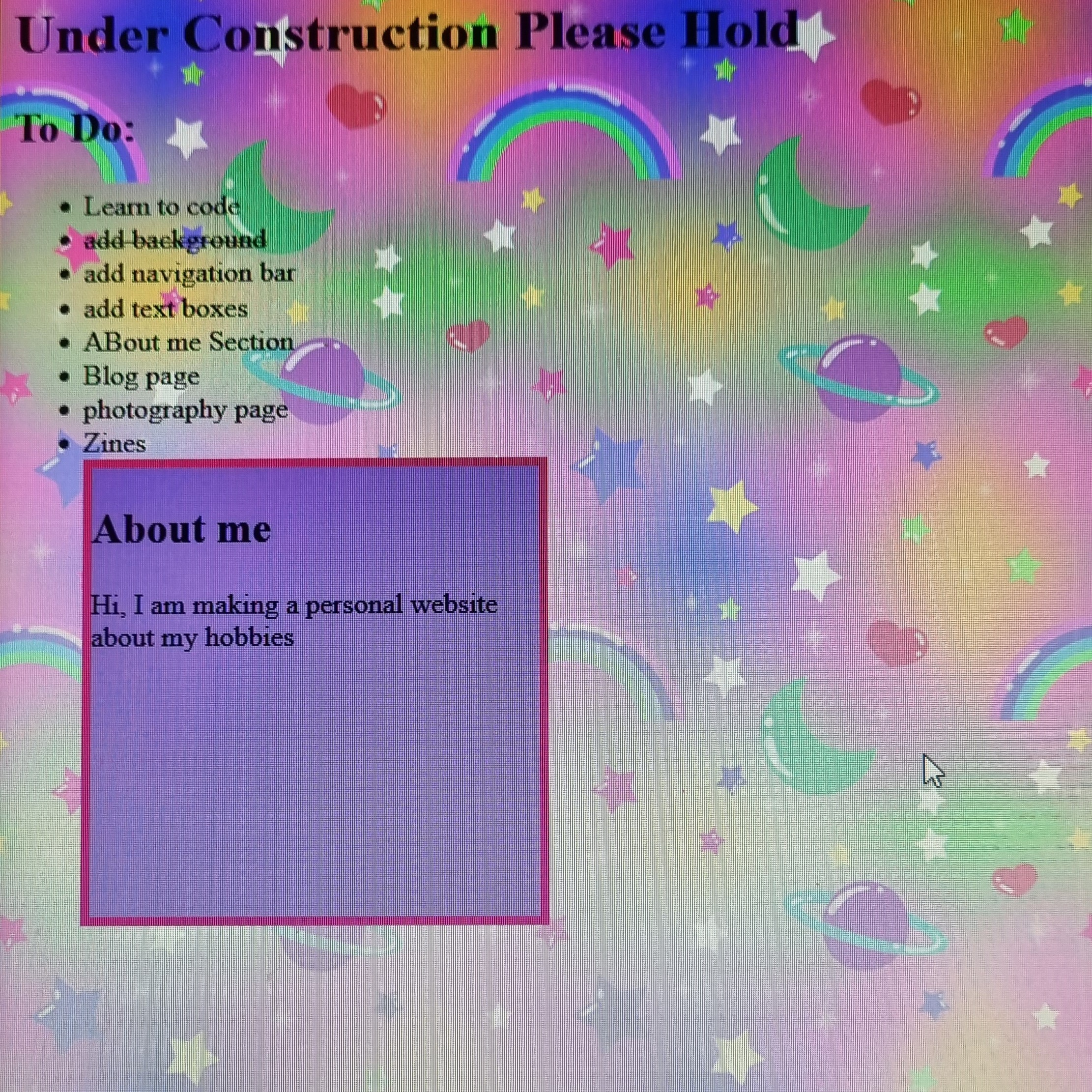
Where it started

where we are now
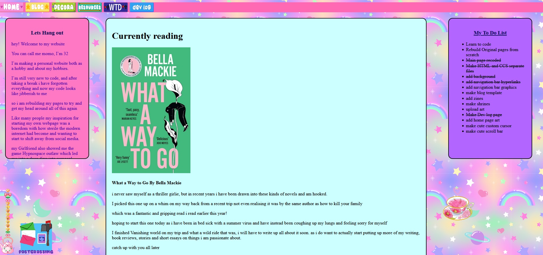
i still have alot to learn when it come to coding but i feel like i have come so far in only a small amount of time
It also feels really cool knowing i made somthing from scratch, every line of this code i wrote myself and if it dosent work then i learn somthing new i didnt know.
it is both hardwork , time consuming, but also easier than i thought it would be to build my own page.

little fixes i have also added today, are running the main page feed through word and spell check to fix the mystakes my Dyslexic ass made in my spellings when just free form typing into the code

Post crossing icon and link on main page
9th of July 2025
progress is slow but even tiny updates are somthing,
sometimes i wish i could download all my ideas for a website directly from my brain into code hahah
made a silly little icon for my post crossing page
and added a link from it on my home page so the post crossing page is acctually reachable now.
its so easy to get distracted because in my physical media hype i have ended up hyperfixated on my old PS1 games,
Ive seen people do some really cool collection pages so i am kind of inspired to create somthing to showcase all my hobbies
Also It is Now Disability pride month, so here is to all my fellow disabled webmasters out there

Post crossing mini Update
20rd of June 2025
the summer is already sneaking away from me, I had a trip to London with a friend to see Babymetal, Bambi Thug and Poppy
but after the trip i got sick and was knocked out for two weeks with a nasty cold
now im back up and running again but the heatwave hitting the uk is absolutly destroying me
one of the symptoms of my Chronic Illness is Heat intolerance and poor tempreture regulation.
so I am absolutely dying and my joints are all inflamed from the changes in tempreture and atmospheric presure
annnnnnywayyy....
Just adding some mini Updates while i cook dinner and wait for our BG3 gaming night to start
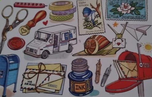
Added some more of the postcards I have received from post crossing to the page I intend to write about them and the things that bring me joy about connecting with others via snail mail across the world too
In the background i am working on some other things.
- Sims page - im building a forever world in the sims and want to add updates about my builds and legacies, currently im rebuilding willow creak in sims 4
- I downloaded my whole sites code after all the DDOS attacks on neocites because i am afraid of losing my code and am looking into what kind of external code editor i should use, i do enjoy the ease of coding on site, however i have heard that VS code has live preivew functions which i am pretty excited about.
- I saw a site called TopHatCats who has created a Digital Ita bag Look how cool they are and i really want to create art and learn how to code somthing as cool as this as I have so many Buttons and blinkies that i have been gathering and want to share all my Favourite things
- I also need to set up a page for my board games, and TTRPS respectively as well as my writting and reading reveiws.
Essentially i have so many ideas bubbling up like soda pop and so little time
Keep on Keeping on my peeps

Reading Update
3rd of June 2025
Just added an update to my currently reading,
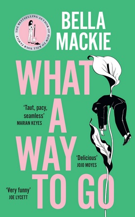
currently sick and feeling like trash though
Also Happy pride month to all my Fellow LGBTQIA+ Web masters

An Accidently Deleted Dev Log
22th may 2025
that heart breaking feeling when you realised you have fucked up and deleted a part of your code and its too late to retreive it
I was adding todays DEVLOG "Reletive positioning and making things work"
but in doing so i Accidently deleted forever the devlog from the 20th may 2025
it was only little and about me slowly trying new things and adding stuff to my website
and about how i was adding a page about my penpaling and post crossing hobby
and now that original post is gone forever
i cant remember exactly what i had written other than i am just doing bits and peices in the odd spare hours i have here and ther
and how i may be slow and this site may look like trash but at least it is my trash
i debated between putting this at the top as a new update or in the slot between the new update and the old post would have once been
because i wasnt sure what would give better continuity
i might just leave it at the top at the point i realised my mistake

Reletive positioning and making things work
22th may 2025
so I found out how to do a thing that i wanted to do
which is controlling exactly where i want an image to apear on a webpage,
it is called reletive positioning
and in theory if i set the position of things correctly they should sit on my page how i want them
however I must have somthing slightly wrong as when i tested trying to space out these post card images that i wanted to display they just ended up in a line under one anothe
so for now i am just going to leave each one in a cute little wonky line like this for now
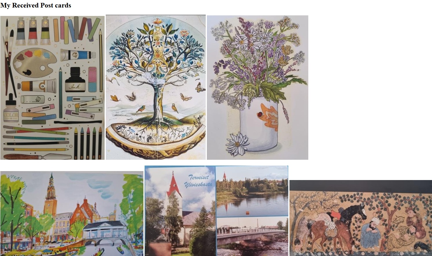
then box everything up to the same size and get them positioned cutely and add alt text for each one i should add this to my ever growing to do list
My To Do List
- Learn to code
- Rebuild Original pages from scratch
- Make HTML and CCS separate files
- add background
- add navigation bar hyperlinks
- add navigation bar graphics
- make blog template
- add zines
- make shrines
- upload art
-
Make Dev log page - add home page art
- resize custom cursor
- make cute scroll bar
Make Penpal and Postcrossing page- add physical media page
- Add TTRPG Pages
- add to WTD page
- upload decora looks
- Figure out reletive positioning

Just a little somthing cute
10th May 2025
okay so i needed a distraction from some boring paperwork i was doing but i did not have the mental capacity for working on the in the background improvements that i am doing.
so i just decided to add a little somthing to my current home page for funsies
i do read a lot so i thought i would add a curtrently reading
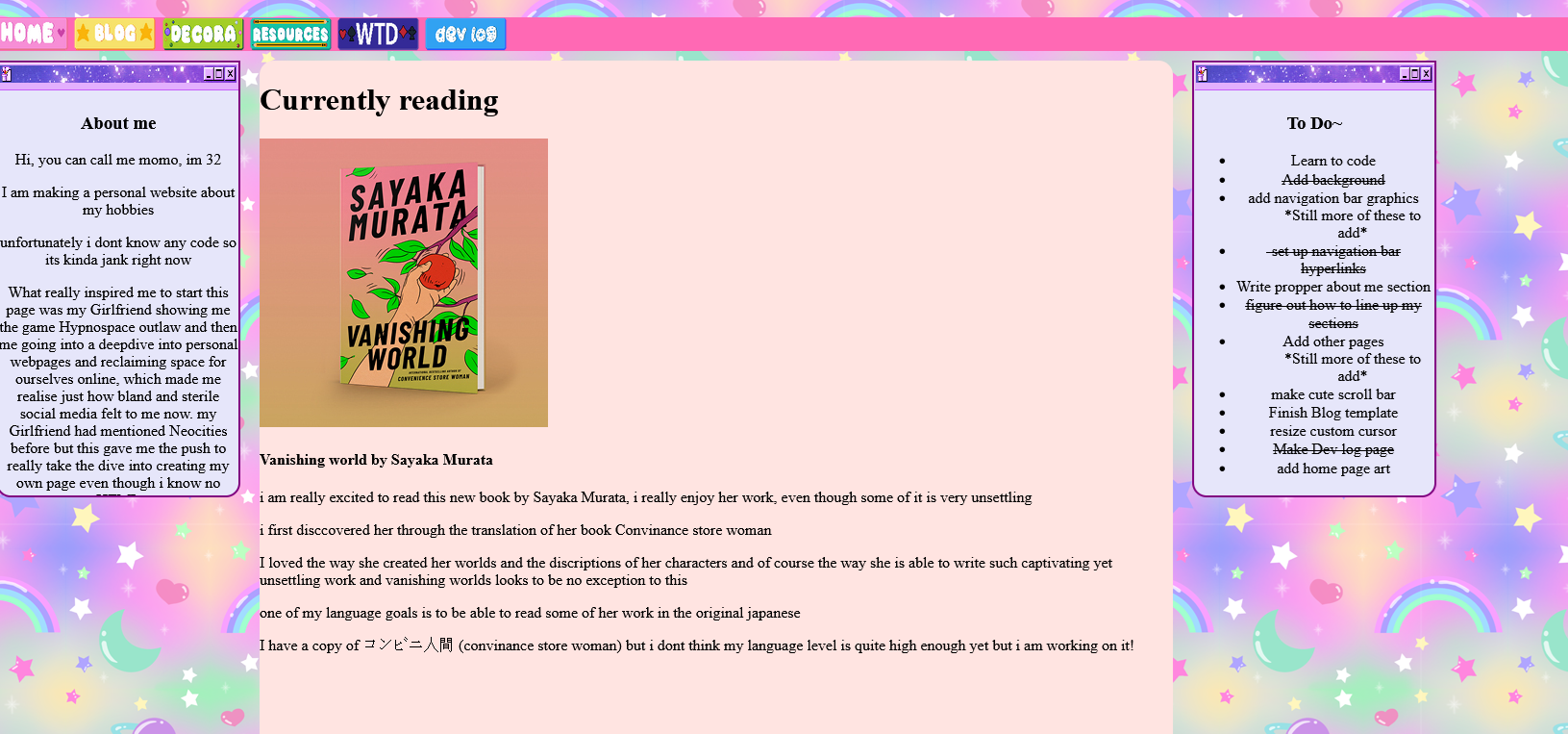
maybe i will add a book reveiw page too at some point
Quick add it to the to do list!!
might add other little cute bits today as distractions i will have to see what i have time for

Working on the Grid Grind
9th May 2025
so, I started testing out how grids and container grids work andf i feel like i am actually making some progress
everything may have broken to start with but after so wiggling around in the spaghetti code abyss i think i am starting to make sence of how to make the rows and collums work.
After i fixed where my three current elements were sitting i tried to add a cute image under About me and to do
setting the image to row two seems too low down, but setting it to row one overlays it over the text box - which is cute but i am not sure how to position it exactly where i want it yet
I dont have much time to work on the site today as it is game night and BG3 is calling our squads name so i think i am going to leave it at that for now

this page is still going to be pretty broken though until i transfer all the code over hahahah
I still have so much to learn but it is fun to document the process love and peace to all my fellow little webmasters

Slow progress and updates
26th April 2025
yikes it has been a while, life got kind of crazy and i didnt have the time to sit down and work on the site and before i realised it 6 months had zoomed on by!
when i came back to this i looked at my code and my eyes hurt - nothing made any sense to me any more, because i hadnt continued practicing my coding i had forgotten nearly eeverything
so although it may look like nothing has changed i have been working away in the background
rebuilding this page step by step
although i wont update the live files just yet as it currently looks like this
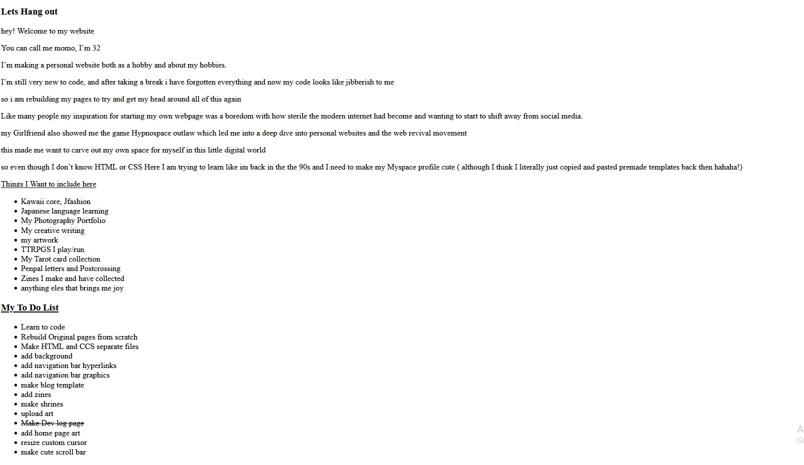
that is because when i first built this page I knew nothing and putting the CSS in its own file seemed scary
but now i see how much more confusing it is to me having everything in one place
hopefully this will soon be a new and improved home page and the other pages will follow
this is a whole journey and i have so much to learn
 - this is me
How do Grids Even work
one of the biggest challanges i have faced from the very beggining is understanding how to get certain parts of my website to show up in the right place
What even is the difference between Flex and grirds what does my site even need
If i have this here how do i get an image under that
these thoughts are still very much a work in progress - but im just happy i can make my 3 current elements line up with some ease
alot more ease than when i first tried to code this site ( see devlog : day two of working on this website(24/09/24))
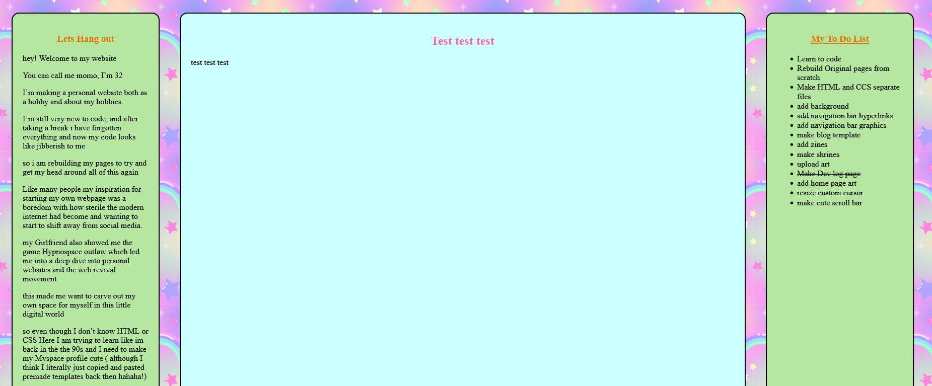
i think my next port of call is figuring out how grids work, i think i need to make a containing div and then make all the other divs elements inside it or somthing and then set the row and collum or .... somthing
3rd October 2024
Removed the birthday stuff from the home page until next yearAdded some actual content! my first blog post, im still tweeking out the formatting but it feels good to have just somthing on the site that isnt just TEST TEST 123
I noticed the editor has been reverted back to how it was before, i will miss the auto-fill but am glad to have my colour theme back and the annoying floating sidebar thing gone!
updates will probably be limited to small things like this until next week due to prior commitments.
October Second 2024 Its My Birthday
There wont be a whole lot of updates today, as i am going to be celebrating with my Girlfriend and I am just updating now in a insomnia fueled frenzey but i did learn how to add custom fonts, I removed the Dev log posts from the homepage as they are all moved to here now. I added a temp Birthday homepage for fun I was hoping the site would have been a little more functional by today but it is starting to resemble somthing that looks like a website even if there is still so much more to do i removed the custom cursor from the homepage as it was being a little buggy when i was testing the links i broke yesterday Also the code editor on neocities has changed when i logged on my theme was all diffrent, there was a weird preveiw of the code on one side and now there is auto-fill while you are typing for diffrent elements
Not going to lie my autistic brain freaked out a little, i had just gotten used to everything and now everything has changed and i suddenly felt like i couldnt code anymore
i found the preveiw of the code on the side of the screen really distracting it kept catching my eye while i was trying to focus.However the auto-fill is actually really useful and somthing that i had considered going to an external editor for so this is a nice quality of life update
I am starting to get used to the preveiw in the side bar being there, but every so often it annoyingly catches my eye
i hope i will get used to it as i continue working on the site but it did catch me offgaurd when everything had changed and there was nothing to tell me that this was the case
Im really excited to start working on my WTD page and my Collections page, I have been on a physical media hyperfixation alongside discovering neocities and creating personal websites i Have seen people create really cool ways of displaying their collections and i really want to start to impliment these things so i can start to actually have some real content on here
Im also working on a art project through october creating ATCs on a pack of playing cards i did an Anime themed one for October 1st but todays one will have to be birthday themed for sure im not sure if this will go under art or collections or both? there really are so many things to think about just to have some basic content up and it is a little overwhelming. Anyway - Catch you all tomorow this birthday party needs to get the show on the road, and i demand cake

Heck Yeah, Welcome to the offical Dev log page
October 1st 2024

If you are reading this then you can probably already tell by the heading and the swanky new page that today i added the Devlog page to document my process in making this website and learning to code
Added Dev page using the frame work that i used for the blog page
found that the posts werent posting in the Div and were just plain black text
realised i had forgotten to set the peramerters for the dev post divs
coppied in the one from the blog page - annnnnd everything is in a line instead of a collum ???
Set Flex container to collum
coppied the logs over from the home page and.... its broken black text again
copy over the test posts from the blog page
They work?
re add the logs and its broken again - there must be a typo in the code here somewhere
rework the logs into my spaghetti code and now its working Horray!

Whoops in setting up some things and sorting out the Navi bar i broke the WTD link, had to go through every page and edit the links on the navi bar but ive fixed that now i hope
I am finding coding this site rewarding when i can solve problems i didnt even know i could cause but its also really intresting how easy it is to make a fucky-wucky
tested all the link backs between pages and they seem to work
added photo to day one post of how the site first looked hehe - now everyone can enjoy just how basic this baby was after 7 hours and how little code i knew
Day 6 30/09/2024
Had to take a day off yesterday, but i am back at it again today! 
first things first i have reordered this section so the new posts are at the top so you dont need to scroll to see what is new Yay! It should make it easier when i am moving all this over to its own dev log page too which i am working on soon
Added Wreck this deck page -WTD is a solo RPG by becky annison /Black amarda games that i have been following for a while
changed the theme and colours on the WTD page to better match the themes of the game.⠀⠀⠀⠀⠀⠀⠀⠀⠀⠀
Day 5 27/09/2024
I havent had much time for working on the webpage today, I'm actually only working on it because it is 4am and i cant sleep. I wanted to figure out how to set up the blogpage - i have seen some inspo from other pages and i really want to recreate somthing like that, but i havent had the time today so i figured i would just set up the barebones perameters for the Div and just fill it in with a tempoary colour until i upload the files to take its place.its pretty basic right now with just some place holder text to test the formatting.
I started working on some art to put on the home page too, i just need a solid day to really sit down and add in all the things i have been working on in the background.
On another note ive been gathering cute blinkies, gifs, and stamps to gather up and put on my page as there isnt much of an update today here is some sushi

Tomorrow i think i will work on moving al of this to its own Dev log page and have each section as its own post, it will be a good way to test out the blogging format too
Day 4, 26/09/2024
Only some small updates today, I fixed one of the minor errors that was being flagged in the code, it didnt change anything in the website itself it just stopped the code editor here on neocities from yelling at me I drew a pixel art of some tri colour dango to test out as a custom cursor and added the code to test that out on the home page, It came out bigger than i was expecting, i had folowed the recomended size due to scaling in peoples browsers but oh no it does not look right at all, i also made two versions, one with an outline and one without - i think i like the one with the outline better so i will keep that in mind when i redraw it in a smaller scale. im still pretty new to pixel art but i am sure i will get better at it as i start creating more things for my site, i have a load of ideas of things i want to add in the coming weeks and have been really inspired seeing other peoples sites on here too. I think one of my main goals over the next week is to Pretty up the homepage with my artwork and pictures and hopefully set up a template i like for the blog page and probably create an actual dev log page documenting this process of me learning to code from scratch.Seeing as i have gained a couple of followers i have also added some of the things i am likely to post about to the tempory about me box
I also need to see about adding some kind of geust book on here ⠀⠀⠀⠀⠀⠀⠀⠀⠀
Day three ( 25/09/24)
Lets goo, Im sleep deprived and hungry - really need to go do a food shop, i awlays thought that web dev things would just be somthing that i would never be able to do, it seemed so complicated and out of reach and well it is a whole other language afterall but i am determind and well, if i can learn 日本語 then i can learn a programing language right? i think its funny how our perception of what seems imposible to do varies so much from person to person.but i digress. today i have a couple of goals for the webpage. get some links working to diffrent pages on the site and create some more pixel assessts. depending on how long that takes me i might take a look at actually formating this text so it looks good instead of just a box of bland defult text and maybe some other things on my list too. its my birthday next week so maybe i will make a digital birthday party page for funsies
Dyslexia strikes again!
okay so i know why i was not getting the links to work now. i kept trying and trying and it wasnt working so i tried just doing a text link and still nothing and i was like what??? so i went back to the tutorial and copied their example that just linked to the tutorial page and it worked? but i was sure i had done it the same way, until i looked a little closer and saw my silly little self had written HERF and not HREF AAAAA!!!! on the bright side the navi bar now links to things, but there is nothing on those pages yet other than the home page linkI added the navi bar and styles to all the pages so now all the pages can link back and forth nicely
I also noticed that this middle div was getting rather full so i have figured out how to set it to scroll the diary text might not be there yet so i tested it with some good old fashion Lorem Ipsem and it scrolled just like i wanted i am going to have to add make a cute scroll bar to my list of things to do now
moved the to do over to the div on the right hand side, but now my code is angry about the div ending too soon and i dont know why i swear coding is like trying to tame a wild animal you cant move too suddenly or it will get angry, you have to let it think that it is in control.
it sensed i had figured some things out so now it is like ahha! lets throw a spanner in the works this site might be pretty janky still right now but its my little janky space and i love it
day two of working on this website(24/09/24),
I have made and added the navi buttons for home, blog and, decora, however i cant seem to get the code to work on them to actually link through to the pagesi also havent figurred out how to line up this section with the "about me" box - ive tried float, grid and flex and nothing seems to be working right i am going to have to go back through the code and figure out where i am going wrong.
ITS TAKEN ME ALL DAY BUT I FINALLY GOT FLEX BOX TO WORK
i feel kind of silly its taken me all day but i was so happy when i saw those little boxes all line up - i even added a 3rd box on the other side for good measure hahah!
added back in the Navi, its just static images in a Div atm but i will try linking it all up tomorow. i still have more graphic elements to make too i have been using Aseprite for making the buttons I have been using guides frorm Sadgirl who i also got this background from and will set up a proper link page soon and W3school to get the Html basics down ⠀⠀⠀⠀⠀⠀⠀
website day one (23/09/24):
this is just place holder text atm but i will use it as a dev log i geuss there is alot i need to do, I hyperfixated and spent 7hours on this totaly basic as heck page check back soon
